The Guild for Human Services launched a new logo that marks a change in its visual identity, and presents The Guild as evolving; reflects strength and the direction of its services; and underscores its commitment to serving at-risk populations.
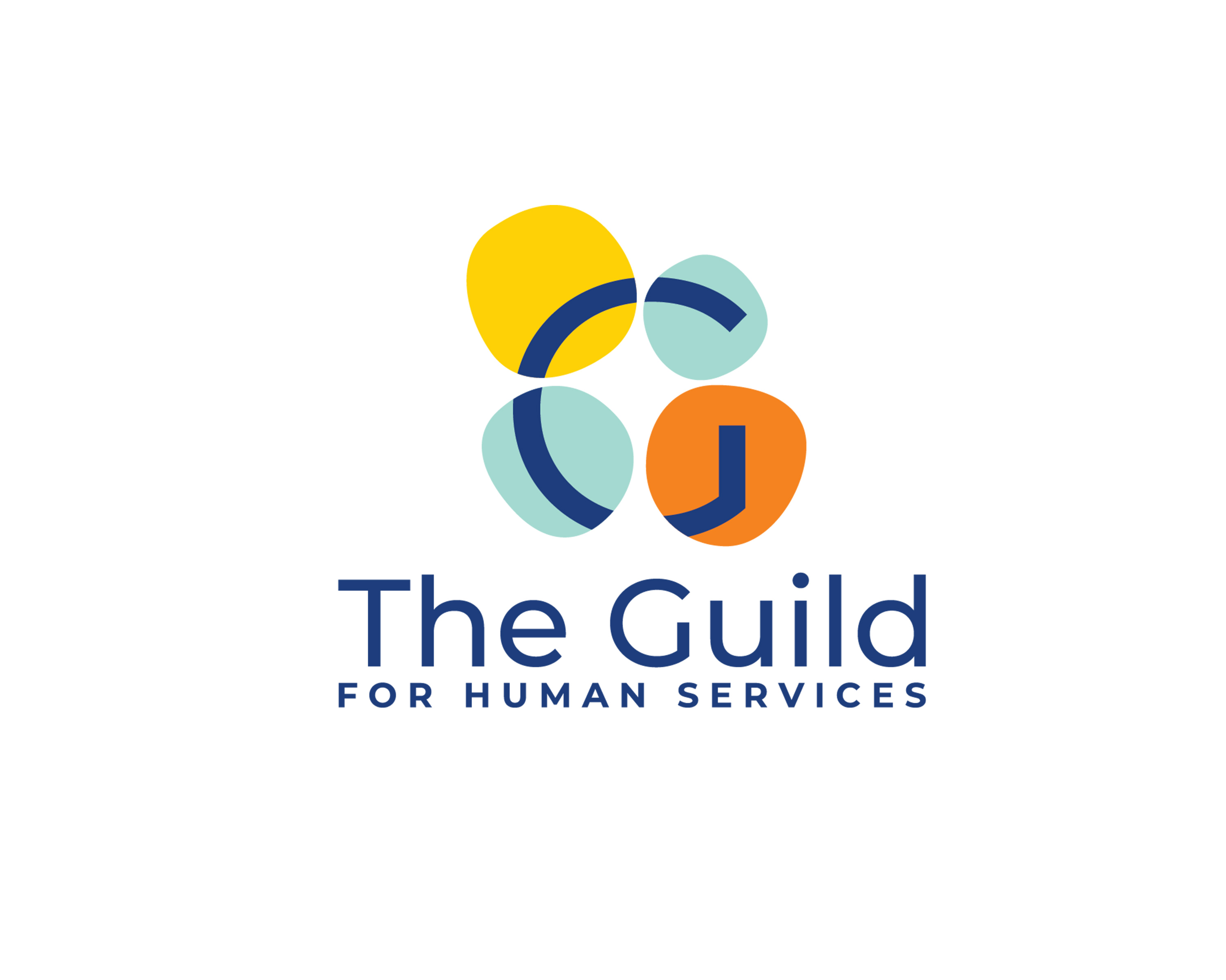
Through use of a modern, contemporary version of The Guild’s iconic G, the brighter, multicolor logo better represents The Guild’s identity today and also pays homage to its venerable history. While The Guild’s G is at the center of the new design concept, the logo displays four organic circles that symbolize the letter G in the braille alphabet, in recognition of the organization’s origins as The Protestant Guild for the Blind. The circles also portray unique individuals coming together in unison and with a sense of belonging at The Guild.
“We are delighted to share our new logo with The Guild community and our extended family of friends,” says Steven Belec, The Guild’s chief admissions and outreach officer. “The logo better communicates what The Guild stands for, and represents the vibrancy of today’s Guild while also recalling our reputable history of serving individuals with disabilities.
“We’ve kept some visual elements that reflect our heritage, but emphasized our forward-thinking mindset and mission to educate, encourage and empower individuals with intellectual disabilities.”
In establishing a fresh identity system, the new logo represents a component of a larger Guild rebranding effort that includes a forthcoming website redesign. The logo will be employed in a variety of online and print marketing materials: an Americans with Disabilities Act-compliant website, social media engagement, digital presence, signage, brochures, advertisements, conference banners, apparel, stationery and more.
For the logo design, The Guild partnered with Artists for Humanity (AFH), a Boston-based venture that brings together youth apprentices with professional artists on innovative projects. One of the youth artists who worked on the logo, “Pineapple,” took pride in the design effort.
“Our AFH graphic design team has the opportunity to work on an array of amazing projects, but The Guild for Human Services has been an especially fulfilling one,” says Jonathan Tejeda, aka “Pineapple.” “It has been a great adventure that has challenged me to gain a new perspective on accessing visual design within an educational space. We are honored to create systems and visuals that better reflect how energetic, caring and dedicated The Guild community is each and every day.”
AFH is also working with The Guild on a wayfinding project that will make it easier for students and visitors to navigate The Guild School.
The Guild community, including students, adult residents and staff members, provided input throughout the process and decided upon the logo design in a community-wide vote of nearly 2 to 1 over other design concepts.